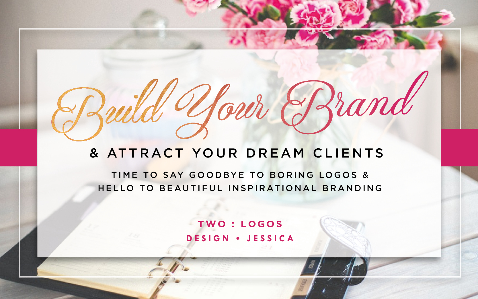
Welcome back to the Build Your brand & Attract Your Dream Clients series, where we say ‘goodbye’ to boring logos and ‘hello’ to beautiful inspirational branding.
Throughout the series I will explore what branding is, and throughout the following posts I will aim to show you how great branding can attract your dream clients, how companies build strong brands, and how you can do it too.
If you have, how did you get on with your mood boards? Are you inspired? I’d love to see some of them so please comment below or post your photos on my Facebook page.
Today we are talking about logos and how to create a unique and stylish logo for your business.
A logo, although a very small part of your brand, is a crucial element of your whole brand identity. From their first visit to your website through to your business cards, social media and hopefully that final invoice, your logo is seen more than any part of your brand and so it needs to show the world what you and your company are all about.
A well-designed logo should stand you out over your competition, so today I am going to show you how to do this.
A logo is something that, if done well will be with you for a long time so it needs to be done right. Whether you outsource this to a graphic designer and branding expert, like me, or are attempting to do it yourself, I have some brilliant tips and tricks that will help you along the way.
It all starts with research. From the first post you should now have your mood board all set up and ready to go, this is the foundation of any design or brief that you put forward. It needs to be filled with standout logos, colours, fonts and images that you love and you feel will fit with your company brand values.
The next step is to start the design, it’s time to get sketching! After receiving the brief from my clients, I always start by drawing. This is the most exciting part, where all the ideas and inspiration come together. Don’t be afraid at this point, you’re just getting all your ideas on paper.
After the initial drawings are finished the next step will be to eliminate the weakest concepts and the ones that you just don’t love. This can be tricky but the greatest thing you can do here is not ask for other opinions. Everyone will have one and it will be confusing for you. It’s your company and your logo and you need to love it, so be brave and honest with your choices.
You should have narrowed the designs down to one stand-out concept that you need to re-draw digitally in software like Adobe illustrator. If you’re are doing this yourself then there are lots of online tutorials that can help you, or you can send it to a graphic designer who has the skills to be able to do this for you.
It’s time to add your text. At this point, after drawing the body of the logo, I research my fonts. You will have lots of these on your mood board so that’s the best place to start. I will talk about how fonts work and what to choose in more detail in a future blog post.
Type out your business name a few times and choose some fonts that you think will work with your brand. If you’re on a Mac, Font Book is good for this and you’ll find the same sort of thing in your fonts folder on your PC. DaFont.com is also a great source for fonts, but do remember as you’re using these commercially you will need a license. Don’t forget to read the small print. They’re usually very cost effective and you know that you’ll be legally covered.
Have a good think about letter spacing, or leading, as it’s traditionally known. Maybe you’ll be using upper case or lower case variations and have you looked at the bold and light versions of your font? At this point you can add boxes, known as holding devices, or lines but keep referring to your mood board for inspiration.
Try to avoid things that are too contemporary or on trend. As time passes these date really quickly and although you will no-doubtably evolve your brand as the years go by but you don’t want it to look too dated too soon. You want your logo to be clean, clear, stylish but most definitely not dated. Keep things legible and simple – this has more impact than something too fussy that could get lost at the bottom of an email or on a business card.
Sometimes logos have icons, a strapline or a holding devise, but some of the best logos in the world do not, so stick with what you love but keep it simple.
Never, ever, ever use clip art and pre-made cheap logos! I cannot stress this enough. I have seen so many examples of businesses meeting other businesses at networking events where they both have the same pre-bought logo and no one can remember who is who. You deserve to be unique with all the hard work you’re putting into your company and you deserve your own logo!
Basically, if you can send out a strong confident message that you love your logo you’re all set and with help from the rest of your brand your dream clients will find you.
Next time we will talk about colour theory, which colours to pick and how to apply it to your brand.
I hope you’ve enjoyed this second blog and found it useful. If so I’d love it if you’d like it or share it with someone else who might find it helpful.
If you have any questions about branding post them below and I will be happy to answer them.
So, I will see you next time for more about building your brand and attracting your dream clients.


Leave A Comment