
Build Your Brand & Attract Your Dream Clients – time to say ‘goodbye’ to boring logos and ‘hello’ to beautiful inspirational branding.
Welcome back to the Build Your brand & Attract Your Dream Clients series, where we say ‘goodbye’ to boring logos and ‘hello’ to beautiful inspirational branding. Throughout the series we will explore what branding is, and throughout the coming posts I will aim to show you how great branding can attract your dream clients, how companies build strong brands, and how you can do it too.
I hope you’ve enjoyed the first three blog posts where we talked about what branding is, how to design a new logo and some colour theory. If you haven’t read these I recommend you go back and check those out.
If you have read the introduction blogs how did you get on with your mood boards and your new logos and colours? Are you inspired? I’d love to see some of them so please comment below or post your photos on my Facebook page.
So today we are talking about fonts, typefaces and typography, with tips on how to pick the perfect type to communicate your brand values.
You’ve probably discovered a few text styles you like on your mood boards and with your experimenting with your new logo. How did you get on? Have you got a list of those to hand? This is where to start.
There are literally thousands of typefaces in the world and it can be quite overwhelming, but you should have a good idea about the style of type you’d like in your brand – be that something very traditional and classic or something more contemporary, it could be a feminine soft feel you’re after or something bold and masculine – the font world is your oyster!
Nowadays, there is confusion about the difference between a font and a typeface since the creation of desktop publishing. For this post, I am going to use them interchangeably. Basically, a font is the individual letters options (which used to be the tiny metal letters) and a typeface is the whole family. So, Times New Roman in 9pt is one font, while Times New Roman in 10pt is another font. The whole of Times New Roman in a set is the typeface…. confusing, isn’t it? Most designers today use the word ‘font’ for it both, so that’s what I will do.
So, let’s talk about the types of font styles out there and a little bit about the breakdown of a font family.
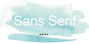
Traditionally fonts are split into two groups – Serif and Sans Serif
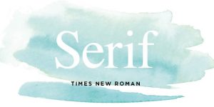
Serif fonts are the ones with the little flicky bits or strokes that come from original writing with a quill or chiselling on stone. This adds a more traditional feel to a font.
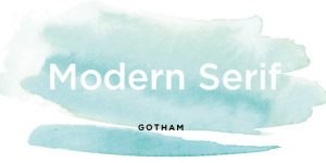
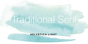
Within these groups you’ll find lots of lovely styles such as modern serifs, traditional serifs and slab serifs but generally these are more difficult to pick out and only relevant to know about if you’re creating your own typeface.

Sans Serif, literally means without serif or without the flicky bits, and these are the more modern looking fonts and were popular after the 1920’s.
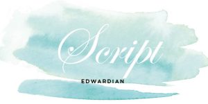
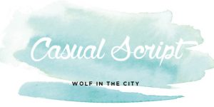
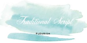
Moving onto script fonts. These are based on old writing forms with ink and are more fluid and are broken down into two groups, traditional and casual. Traditional is something you might find on a wedding invite and adds a classic feel, whereas casual is closer to modern calligraphy or painted signs, Coca-Cola’s logo, although not a typeface has the styling of a casual script font.
Display typefaces are probably the broadest category and include the most variation. They aren’t very good as body text and are best kept for or accent elements that need some personality. They’re more commonly seen in print design, but are becoming more popular online with the use of web fonts to add a bit of personality.
Handwriting and hand lettering are also great for pull-out and accent fonts. Handwriting fonts are digital and can be loaded onto your computer but hand lettering is quite literally text, written by hand, by you or a calligrapher. These can be re-drawn digitally in software such as Adobe Illustrator by you or a graphic designer. Have a look at my recent blog post about my calligraphy workshop with Quill, London.
So, now you have an idea about the style of font you might need it’s time to think about how each of the words and letters will be set out.
Have a look at the weights of your font. Will you using upper case or lower case variations and have you looked at the bold, light and italic versions too?
When picking your final font make sure it has all the letters that you think you will need to use, as well as numbers and punctuation. Many royalty free fonts nowadays aren’t complete and sometimes are missing the ampersand (&) or the dollar and pound sign which can be frustrating when you start creating content.
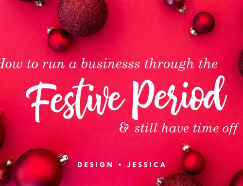
You’ll also want to see what you can do with the leading (the space between the lines of text) and the kerning (the space between each letter). I have added lots of kerning to my own Design Jessica logo to add a modern, contemporary feel.
So now you need to create a list of a few fonts that you will be using for your branding. Keep in mind that your logo font choice should probably only be used for your logo and nowhere else. If you use it for anything else, it can take away the stand-out appeal.
You’ll also need a headline or title font, a body font for the bulk of your text, and an accent font for things like pull-outs or quotes – make that something exciting so it stands out but legible.
Keep referring to your mood board for inspiration and think about the kinds of things that the font will be used for – will it be on websites and social media, or in large print formats?
Your computer comes with a whole load of system fonts, some of which are lovely. If you’re on a Mac, then Font Book is good for viewing fonts and you’ll find the same sort of thing in your fonts folder on your PC.
You can find more adventurous fonts online. DaFont.com is a great source for fonts but do remember as you’re using these commercially you will need a license. They’re usually very cost effective and you know that you’ll be legally covered. Don’t forget to read the small print!
You should by now have a list of your brand fonts. How do they look together? Are they giving off a sense of your brand values? I’d love to see them.
Next time we will talk about patterns, icons and social media design and how to pick the right ones. I hope you’ve enjoyed this fourth blog and found it useful. If so I’d love it if you’d like it or share it with someone else who might find it helpful.
If you have any questions about branding, post them below and I will be happy to answer them. So, I will see you next time for more about building your brand and attracting your dream clients.


Leave A Comment